
Updates to Recruitment School Student Interface
Hello everyone,
This article is a quick post on our new student UI (User Interface). At Recruitment School we are always trying to improve our user experience and after much research our LMS partner has upgraded the Learning Dashboard to provide a “distraction free” learning environment.
Nothing on the front end of the platform has changed however, when you start training you will see massive changes.
First of all, you will see some styling changes to the dashboard. These changes make the dashboard more attractive to the human eye – who knows, maybe even to a dogs eye – will have to ask Billie later.
You will see that in the image above the Yellow Belt is marked “in progress” and there is a dropdown arrow against it. Clicking this dropdown arrow expands the course so you can see where you are up. You will also notice a progress bar at the top which gives you a percentage completion and gather number of steps completed – pretty cool huh?

Clicking on the course name takes you to the course page. The course page shows the course details and a dashboard of the lessons within the course as shown below. Again, the dashboard will indicate what has and hasn’t been completed.
Clicking the title open up that lesson and this is where you will see a lot of changes. The following screen opens
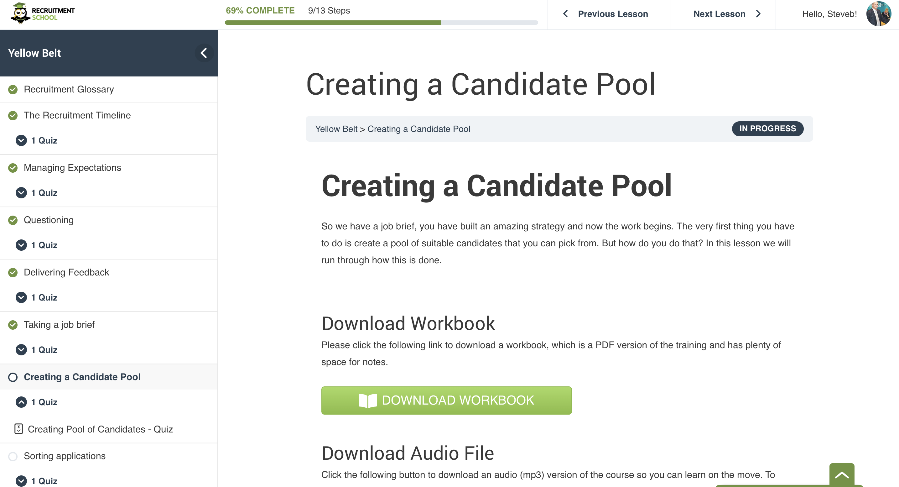
This is where there magic has been applied. At the top of the screen you will see a mini progress meter, showing you where you are at within the course. At the top also are two navigation links to next and previous lessons and a profile pic, which when you hover, provides a link back to course home and logout.
To the left is a course overview that is showing. This is where you can navigate back to other lessons and again can get an overview of where you are at. This menu can be easily collapsed by clicking the < sign to the right of the Course Title in this case, Yellow Belt.
This is a massive change in layout and one that we are very proud to be able to bring to you. We haven’t finished, there will be some more minor changes over the next 4-6 weeks with weeks to colours and icons. There are also some changes to coming to the Group Leader dashboard that will be implemented soon.
I hope you enjoy the new layout and I would love your feedback, so please let us know what you think in the comments below.
Thanks

Want to receive our articles straight to your inbox, then subscribe to our list by completing the form below and just like Ninja Magic, articles will just turn up in your email – amazing stuff.
[agileform id=”5858049288437760″]

